Developing a collaborative approach to problem solving
This article is a guest post by Eric Olive.
Dr. Dani Chesson defines design thinking as an iterative and collaborative approach to problem solving that is particularly effective when the issue at hand requires innovation and change.
In this piece, we outline four UI/UX training activities that contribute to change, innovation, and customer-centered products: Contextual inquiry, personas, scenarios, and journey maps. These activities reflect key design thinking tenets. These tenets include learning from the people, finding patterns, and making it tangible.
Contextual Inquiry: Learning from People
You’ve heard it before, study your users. The challenge is which methods to employ and when. Contextual inquiry, a semi-structured interview method is useful because it combines questions and observation. Normally, researchers begin by posing a set of standard questions and then observe the person in her natural work environment.
However, there are some common misconceptions about contextual inquiry that need to be discussed:
- It takes too long. Let’s just run a usability test.
- Okay, we’ll do it, but we’ve got to send a big team. The product managers will want the opportunity to talk the customers. No, big mistake! This approach vitiates the value of contextual inquiry, which is based on the idea learning from people. Think about it. If you were an employee, would you feel comfortable going about your daily routine if 10 strangers literally walked up to your desk? Or course not, but this happens more often than you might think.
Contextual inquiry is like neurosurgery with lower stakes. It requires a soft touch, a keen eye, listening, and a darn good poker face.
Skip the team huddle and go lean. Your prospects and customers will thank you, and you’ll learn much more.
Send one or two seasoned UX researchers or ethnographers into the field. If two researchers make the trip, ask them to divide and conquer but also to conduct some observations jointly. That way, they can cover more ground than one person but also harness the advantages of two brains as they aim to understand users in their natural environment.
Listen and observe carefully, take photos (with permission), and be aggressively opportunistic. Yes, you read that right. When in the field, you should always be on the lookout for situations, operations, informal meetings, any on-the-ground, real world activity where people are going about their normal routine.
For example, while conducting contextual inquiry focused on operators of heavy machinery in Mexico, a colleague and I stumbled across a group of operators returning from “comida.” We literally jogged over (steel-toed boots are heavy so no sprinting) and started asking questions. We quickly realized that these operators had much to share and listened intently (scribbling notes while standing in the mud) as they identified a serious problem that had never occurred to us or anyone back at corporate headquarters. We learned a great deal during the study, but this single insight alone made the entire trip worthwhile.
Sometimes you don’t need to travel far to conduct useful on-the-fly research. In How we designed our bank account: NuConta — Part I, Erick Mazer Yamashita describes how he and his colleagues interviewed existing customers in a corporate setting before taking a different tack, “To balance that out, we got out of the building to do intercept interviews in places like public universities and spaces, where we could reach a wider variety of people who were not already Nubank customers.”
Again, the point is to be shamelessly opportunistic. How often does that happen in your daily work life?
Opportunistic yes but open and humble as well. As Mazer Yamashita explains, “It was a group of unbelievably bright, but most of all humble people, who were completely open to learning and having their opinions challenged.” (emphasis Mazer Yahamshita’s)
Such humility helps avoid the feature trap (we must keep this feature because we’ve started coding) in favor of literally observing and listening to what your users actually need. Remember, users and customers don’t care about features; they want to accomplish a specific goal such as opening a new bank account, processing a Medicare application, or evaluating cell service providers.
User Personas: Making it Tangible
The main goal of user research like contextual inquiry is to better understand current and prospective users. A well-conducted study or series of studies lays the groundwork for developing personas.
A persona is a fictional description of someone who represents a single user group. Fictional only in the sense that you assign a name and use a generic photo to protect participant confidentiality.
A well-crafted persona is real because it reflects the goals, behavior, attitudes, and likely pain points. As the term “persona” suggests, its purpose is to engage the product and design teams by making the user tangible. Instead of “How might our customers react to our new cell phone pricing plan?” the question becomes, “How likely is Frugal Frida to purchase this plan?” In short, personas help the team visualize the customer and her needs and behaviors.
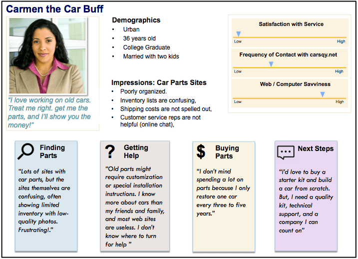
Here’s how it works in the real world. Recently, after conducting a series of interviews, we examined the findings and initially identified three user groups. Upon further reflection and discussion, however, we realized that research had reveled a fourth group with highly specific concerns and behaviors that did not apply to the other group. Four groups mean four personas. The scrubbed example below shows one of the four personas we developed.
As shown in the bottom half of the persona, our interviews yielded four concrete scenarios. While research findings are not always this clean, when possible it’s wise to tease out at least preliminary scenarios as personas develop. Remember, a UX researcher’s goal is to learn how users behave or are likely to behave, often in the context of performing certain tasks.
Scenarios: Finding Patterns
As explained above, clear, clean scenarios can emerge during persona development. Yet, this is not always the case. Often, identifying and fleshing our clear scenarios requires additional analysis of research findings in order to identify patterns showing what users can or are likely to do.
Before starting this in-depth analysis, it’s wise to have a clear sense of what scenarios entail and how they differ from journey maps. While journey maps (described below) are important artifacts in the UI/UX design process, an effective journey map requires solid scenarios. It’s difficult to map out the user’s journey without context.
Scenarios provide this context by describing how the target group will use your product, service, or software to accomplish a specific task. For example,
Carmen restores cars in her spare time and needs four parts to complete the restoration of her 1940 Cadillac V-16. She has scoured online and brick and mortar stores without success. Recently, she heard about carsqy.net and plans to use this site to find out if the parts she needs are available.
Notice that this scenario is concrete rather than vague and high level; it explains what Carmen will do. Yet, the scenario does not include a series of detailed steps. In other words, scenarios occupy a middle ground between high-level statements such as “Carmen likes to shop online” and a step-by-step description such as: “Carmen opens a browser, logs onto the auto parts online store, looks for an air intake s for her 1940 Cadillac V-16, compare prices, selects and places an item in her cart.”
Despite their brevity, well-crafted scenarios are powerful because knowing what the user needs to accomplish makes it easier to decide what to include and omit from the design.
Watch for the following traps when developing scenarios:
- Vague statements such as “Carmen likes cars,” because such high-level statements don’t describe what she will do when she visits your site or encounters your product.
- Delving into too much detail, i.e. a step-by-step description, which is actually a task analysis. Task analysis is important and useful but not at this stage.
- Describing what the system will do instead of what the human will do. For example, “Carmen navigates to carqy.net at which point the system prompts her to create a login. She enters a username and password; the system checks to ensure that the username is available returns a message saying that Carmen must choose a different username.” System functions are important but they should not be included in a user-based scenario.
A well-written scenario avoids any mention of system functions and occupies the middle ground between a detailed step-by-step task analysis and vague statements that do not contribute to a design tailored to Carmen’s needs.
Journey Mapping
Another idea on our list of UI/UX training activities is journey mapping. While a scenario normally describes a single task, such as looking for a car part, a journey map shows the various stages of a customer’s engagement with your company. The more stages and touchpoints, the more detailed and complex the journey map.
There are many ways to approach journey maps, and time and budget constraints may require condensing the stages outlined in this article. At UI UX Training, we’ve found, however, that proceeding from research to personas to scenarios keeps the focus on users rather than slick product features that might not be important users. This may sound obvious, but who among us has not attended meetings where the outcome is something along these lines? “Yes, of course we care about our users, but we’ve devoted considerable resources to ‘Feature X,” and we’re confident that users will see the benefit once it’s in front of them.”
Sure, that’s one way to go but won’t users and stakeholders be better served by putting “Feature X” in front of users to assess their reaction and performance (do they understand the feature and can they use it) before brining the product to market?
Before drawing the journey map, review the research, personas, and scenarios in place to ensure that you have a clear sense of the:
- Number of touchpoints and channels. Does Carmen (classic car enthusiast) call your company, send questions via email, or only look for parts online.
- Time frame. Does the engagement with your company take an hour or occur over a period of days or even weeks?
- What might influence Carmen’s interactions and decisions? Does she turn to friends and family for advice about where to find car parts? Does she always seek information online and, if so, only from your site or similar sites? Or, does she look to discussion boards or other sites?
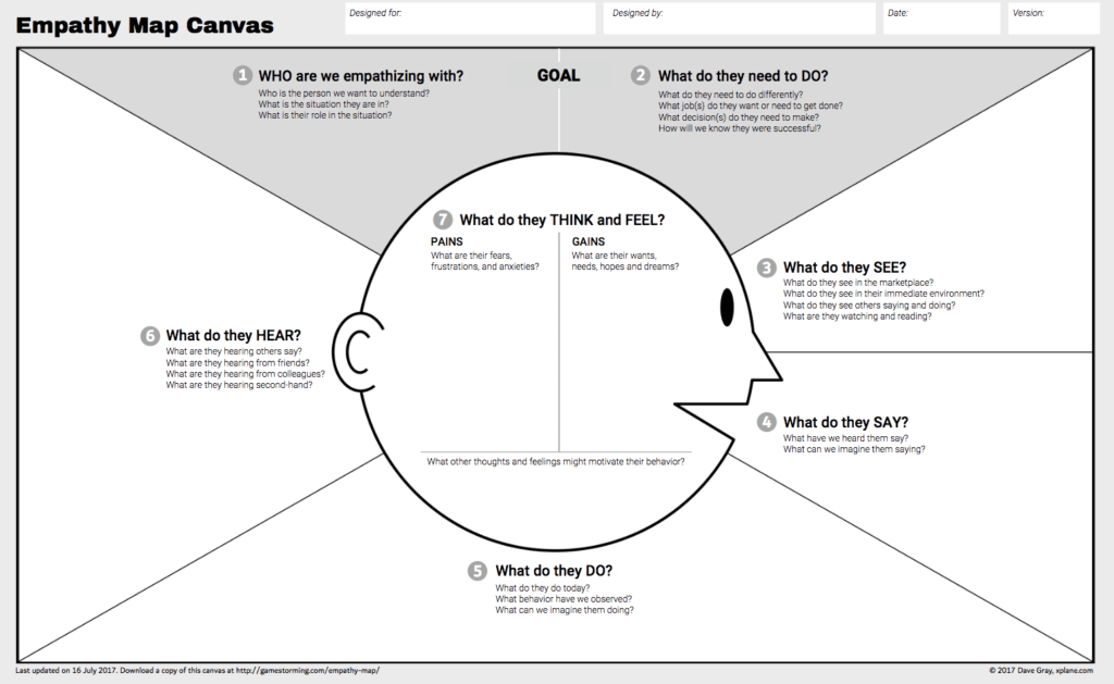
With this information in place, you are ready to begin the journey mapping process. Draw an empathy map to examine the persona’s feelings and attitudes. Remember, you’re dealing with humans. Their actions are critical but so are they emotions because emotions influence purchase decisions.
Use visionary Dave Gray’s updated empathy map to create an empathy map for your persona.
An empathy map for Carmen would likely include the following points.
- We are empathizing with Carmen, a car enthusiast who is also a busy mom and working professional meaning that it’s challenging to find time to work on cars.
- Carmen needs to find affordable parts for her 1940 Cadillac V-16.
- She sees many options for auto parts in general yet not many places for the parts she needs.
- Expressing frustration: “I want to find the parts I need right now. I don’t want to waste time.”
- After getting home from work, Carmen checks to make sure the kids are doing their homework, changes into junky clothes and heads to the garage where she spend 30 minutes checking her work from the previous weekend.
- Hears friends supporting her commitment to her hobby and her mechanical skill. Hears extended family complain about her hobby: “Why do you spend time getting your hands dirty when you could be spending more time with us and the kids?”
- She derives great satisfaction from the gradual progress she has made over the past four weekends re-building the 1940 Cadillac V-16. Carmen is also frustrated because the inability to find specific parts is slowing her down. She is particularly annoyed by the snotty, unhelpful customer service representative from Carsqy she contacted via online chat last week.
With the empathy map in place, you’re ready to draw a journey map.
Note: For large, complex projects with a many data sources (brainstorming, interviews, ethnographic research, surveys, etc.), it may be useful to draw an affinity diagram. In this article, we’ve deliberately used simple examples focused on a single task in order to present specific UX techniques that will contribute to robust design thinking.
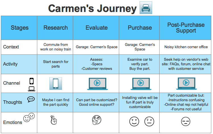
Refer to your persona, empathy map, and research findings as you start sketching. A simple journey map for Carmen might resemble the following diagram.
The example above is basic. With time, team effort, and a talented visual designer, you’ll develop a robust journey map with high-touch graphics to share with stakeholders. As with personas, the idea is to bring users and customers to life by literally showing what they do and what matters to them as consumers with limited time and resources engage with your product or service.
Approaching UX research with humility and an open mind will prepare you for the persona, scenario, and journey map exercises outlined in this article. These exercises will help you and your team adopt a design thinking mindset based on learning from users, finding patterns, and making your designs tangible.
About the Author
Eric Olive has spent the past 18 years conducting UX research for Fortune 500 companies in the finance, insurance, manufacturing, healthcare, education, and telecommunication sectors throughout the U.S. Eric’s UX career includes extensive work with Spanish-speaking users in the United States and Latin America.
Drawing on this experience, Eric has taught user-centered design to corporate audiences for four years and has consistently received high ratings for the energy, passion, and clarity he brings to teaching user-centered design and UX fundamentals.


