Learn the basics of data storytelling and find training resources, articles, videos, and more.
Data is all around us – from our schools, to our workplaces, and internet habits. Data storytelling recognizes that data on its own is often not enough to move people to action. Instead, we need to build narrative stories to engage audiences with data and provide value that serves a purpose. In this training guide, we’ll share insights and resources about data storytelling and how it is used in a variety of industries, organizations, and settings. Let’s begin!
What is data storytelling?
Data storytelling is the ability to turn a dataset into a clear narrative that provides insights and context to your audience. Data storytellers interpret the hard “facts” (numbers and figures) to explain and explore the what, why, how, when, and more.
It’s comprised of three critical components:
- Data – the foundation of your story. Analyzing data through a descriptive, diagnostic, and predictive lens can help you better understand and communicate the full picture to your team.
- Narrative – a verbal or written storyline that’s used to communicate the insights gathered from the data, the context surrounding it, and actions recommended to improve/continue direction.
- Visualizations – representations of the data and narrative that help with communicating effectively and memorably. This can be in the form of charts, graphs, pictures, videos, and more.
Why data storytelling is powerful
Combining storytelling with data helps make complicated figures make sense within a context your audience can understand and relate to. When we package up insights into a story, we bridge the logical, data-driven side of our brains with the more influential, emotional side. People feel stories, and telling one is a powerful way to improve:
- Memorability
- Persuasiveness of argument/recommendations
- Engagement
Visualizations and analysis also help ensure that realistic changes, modifications, and improvements are made to make the data even better in the future.
Resources to craft a compelling data narrative
A good data story comprises of the three elements that make up any good story:
- Setup – Set the scene by explaining what’s been happening. Example: sales for your new phone decreased 10% last quarter.
- Conflict – Explore and describe the root issue. Use research, data, and visualization to understand the reasoning behind what’s been happening. Example: young customers on TikTok have been sharing a viral video alleging there is a battery issue with the new phone.
- Resolution – Propose realistic, do-able solutions to the problem and immediate actions to address some of the issues. Example: Launch a public relations campaign to address battery concerns in the new phone.
Below, we’ve shared videos and other resources to help you learn more about crafting compelling data narratives!
1. Telling Stories with Data in 3 Steps (Quick Study)
This video from Harvard Business Review provides a fantastic overview of the three key elements of any story (outlined above) with a clear example of how data and narrative can work seamlessly together to explore and understand a problem.
Video Description: You know right away when you see an effective chart or graphic. It hits you with an immediate sense of its meaning and impact. But what actually makes it clearer, sharper, and more effective? In this video, Scott Berinato, author of “Good Charts” and “Good Charts Workbook”, walks through the three essential ingredients of any story–including those told with data.
2. Telling Stories with Data – method 1 (The “How we got here” method)
In Part 1 of Paul Smith’s YouTube 2-part series, he explores how to tell stories with data using a “how we got here” method. This very simple storytelling technique walks the audience through the context and lets them reach the conclusion themselves. The main character is the business/organization.
3. Telling Stories with Data – method 2 (The Discovery Journey method)
In Part 2 of Paul Smith’s YouTube 2-part series, he explores a second method of telling stories with data, which centers around using your own personal journey of discovery to help your audience reach their own “aha” moment. The main character is you.
4. Turning Bad Charts into Compelling Data Stories | Dominic Bohan | TEDxYouth@Singapore
This TED Talk by Dominic Bohan explores just how important data is and how data can be used to tell stories and explain the world around us. He uses personal stories to provide tips for better storytelling and data visualization via charts and graphs.
Video Description: In our society’s constant hunger for shocking and sensational news, we tend to overlook the importance of what is happening globally. For Dominic Bohan, he sees this world through data and statistics. Though pie charts and bar graphs may sound mundane and even daunting for some of us, Dominic puts forth a compelling argument for the relevance of data science or statistics, and shows us how data can also tell stories and even explain the world to us. In our society’s constant hunger for shocking and sensational news, we tend to overlook the importance of what is happening globally. For Dominic Bohan, he sees this world through data and statistics. Though pie charts and bar graphs may sound mundane and even daunting for some of us, Dominic puts forth a compelling argument for the relevance of data science or statistics, and shows us how data can also tell stories and even explain the world to us. This talk was given at a TEDx event using the TED conference format but independently organized by a local community.
5. Making data mean more through storytelling | Ben Wellington | TEDxBroadway
This TED Talk by Ben Wellington provides an easy to understand example of NYC city heat maps to develop compelling and interesting data stories. Great advice to connect with people, convey a singular idea, keep it simple, and explore the things that you know best.
Video Description: Ben Wellington uses data to tell stories. In fact, he draws on some key lessons from fields well outside computer science and data analysis to make his observations about New York City fascinating. Never has a fire hydrant been so interesting as in this talk. Ben Wellington is a computer scientist and data analyst whose blog, I Quant NY, uses New York City open data to tell stories about everything from parking ticket geography to finding the sweet spot in MetroCard pricing. His articles have gone viral and, in some cases, led to policy changes. Wellington teaches a course on NYC open data at the Pratt Institute and is a contributor to Forbes and other publications.
6. Storytelling with Data | Cole Nussbaumer Knaflic | Talks at Google
In this Talks at Google, Cole Nussbaumer Knaflic explores data storytelling and how to turn data into a visual, engaging story that audiences can connect with and learn from.
Video Description: It’s surprisingly easy to make a confusing graph. No one sets out with that purpose, but it happens frequently—across all industries and by all sorts of well-intending people. One way to avoid this challenge is to never simply show data, but rather to tell a story with it. Former Googler Cole Nussbaumer Knaflic teaches people how to turn data into high impact visual stories that stick with their audiences. Join this engaging session, moderated by Tina Malm and Davey Nickels, where Cole features highlights from her new book, storytelling with data: a data visualization guide for business professionals. Hear about the powerful strategies that were honed through her work on the People Analytics team and the data visualization course that Cole created at Google and taught at offices throughout the US and Europe.
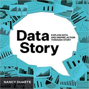
7. DataStory: Explain Data and Inspire Action Through Story

This book by Nancy Duarte takes a business-focused approach to data storytelling to help organizations use data to identify problems and opportunities. Find it here on Amazon.
From the Amazon Book Description: DataStory teaches you the most effective ways to turn your data into narratives that blend the power of language, numbers, and graphics. This book is not about visualizing data, there are plenty of books covering that. Instead, you’ll learn how to transform numbers into narratives to drive action. Nancy Duarte is one of the preeminent storytellers in American business and the acclaimed author of Slide:ology, Resonate, and the HBR Guide to Persuasive Presentations comes this book that will help you transform numbers into narratives.
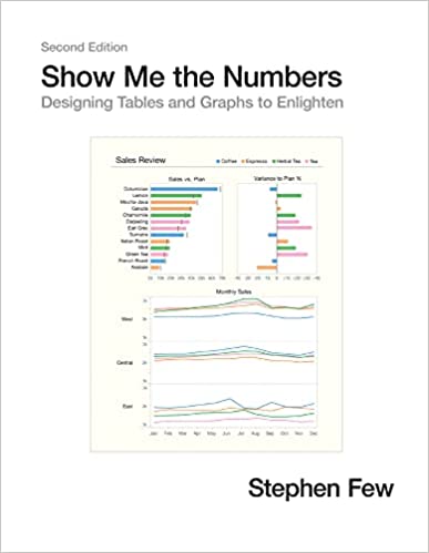
8. Show Me the Numbers: Designing Tables and Graphs to Enlighten

This classic textbook is now available in Second Edition, featuring updated figures and 91 more pages of content to help users understand how to use and design tables and graphs for effective communication. Find it here on Amazon.
From the Amazon Book Description: Most presentations of quantitative information are poorly designed—painfully so, often to the point of misinformation. This problem, however, is rarely noticed and even more rarely addressed. We use tables and graphs to communicate quantitative information: the critical numbers that measure the health, identify the opportunities, and forecast the future of our organizations. Even the best information is useless, however, if its story is poorly told. This problem exists because almost no one has ever been trained to design tables and graphs for effective and efficient communication. Show Me the Numbers: Designing Tables and Graphs to Enlighten is the most accessible, practical, and comprehensive guide to table and graph design available.
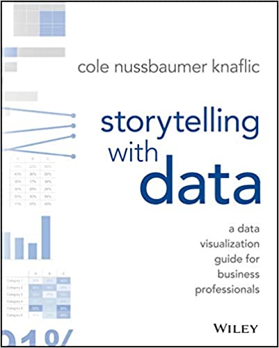
9. Storytelling with Data: A Data Visualization Guide for Business Professionals

This book demonstrates how to understand the root of your data and how to use it to create an engaging, informative, and compelling story. Learn how to understand the important of context and audiences, think like a designer, leverage the power of storytelling, and direct your audience’s attention to what matters most. Find it here on Amazon.
From the Amazon Book Description: Storytelling with Data teaches you the fundamentals of data visualization and how to communicate effectively with data. You’ll discover the power of storytelling and the way to make data a pivotal point in your story. The lessons in this illuminative text are grounded in theory, but made accessible through numerous real-world examples—ready for immediate application to your next graph or presentation.
10. The next chapter in analytics: data storytelling
This article from MIT Sloan underlines the importance and need for data scientists who can present data in a way that helps organizations leverage it for more intelligent decision-making.
11. A Data Scientist’s Real Job: Storytelling
This article from Harvard Business Review provides some helpful tips for turning data into useful insights.
12. Data Storytelling: Separating Fiction From Facts
This Forbes article actually highlights myths about data storytelling and can be a useful “check” against some of the biggest struggles data storytellers face when trying to develop a compelling narrative.
Conclusion – Data Storytelling Training
With so much data out there, the ability to understand, interpret, and conceptualize data in compelling narratives can not be understated! Data storytelling is just another way to innovative and spark action, whether that’s in your business, organization, or personal life.
Please contact us to learn more about our storytelling for business training, innovation workshops, design thinking training or innovative facilitator program.
